PLAY
The Challenge
Helinox, known for ultralight camping gear, wanted to expand into "PLAY" as a fun, accessible category to broaden appeal beyond serious adventurers. However, launching without a unified aesthetic risked diluting the brand's premium ethos. The design needed to evoke playfulness, interactivity, and team spirit while scaling for future games. Retail shelves demanded eye-catching elements to compete in crowded outdoor/sports sections, and packaging had to educate shoppers quickly—showing setup and play without overwhelming.
Key pain points:
- Brand Extension Risks: New category could feel disjointed from Helinox's minimalist, rugged identity—needed to infuse fun without losing core elements like clean typography and nature-inspired motifs.
- Scalability Needs: System must accommodate diverse games (e.g., throwing vs. tabletop) and future additions, using modular elements like colors and icons.
- Shopper Engagement: Packaging should intrigue at a glance, with quick-start guides to convert browsers to buyers in-store.
- Retail Visibility: In competitive aisles (e.g., REI, Dick's Sporting Goods), designs had to pop with bright, energetic vibes while maintaining sophistication.
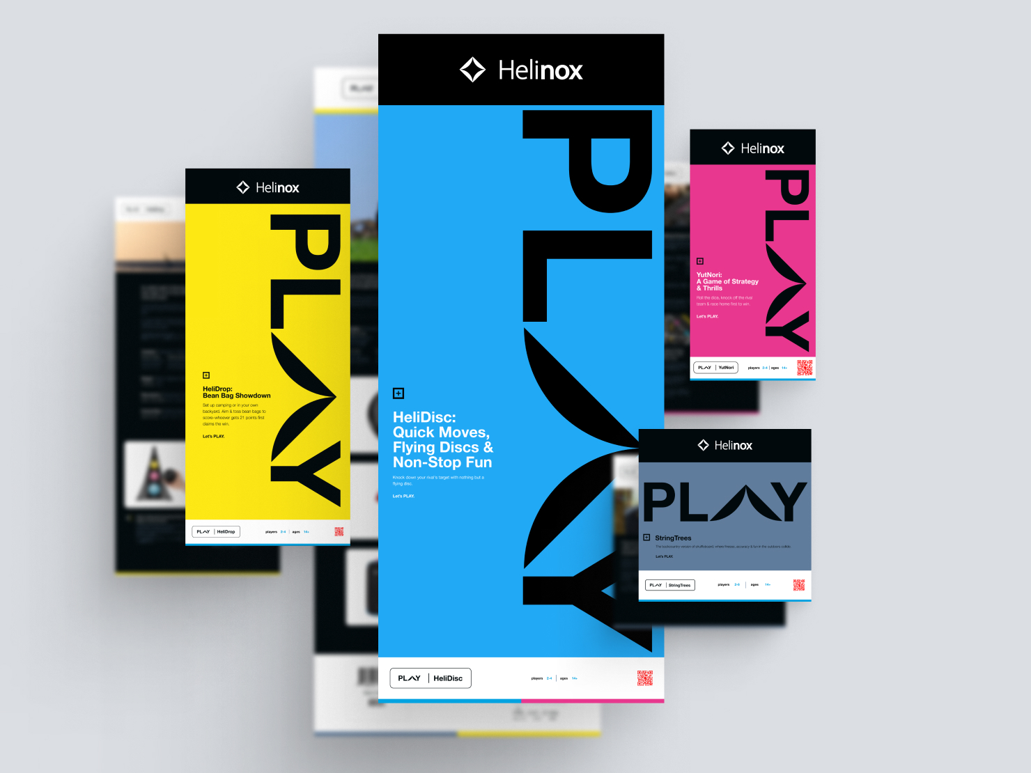
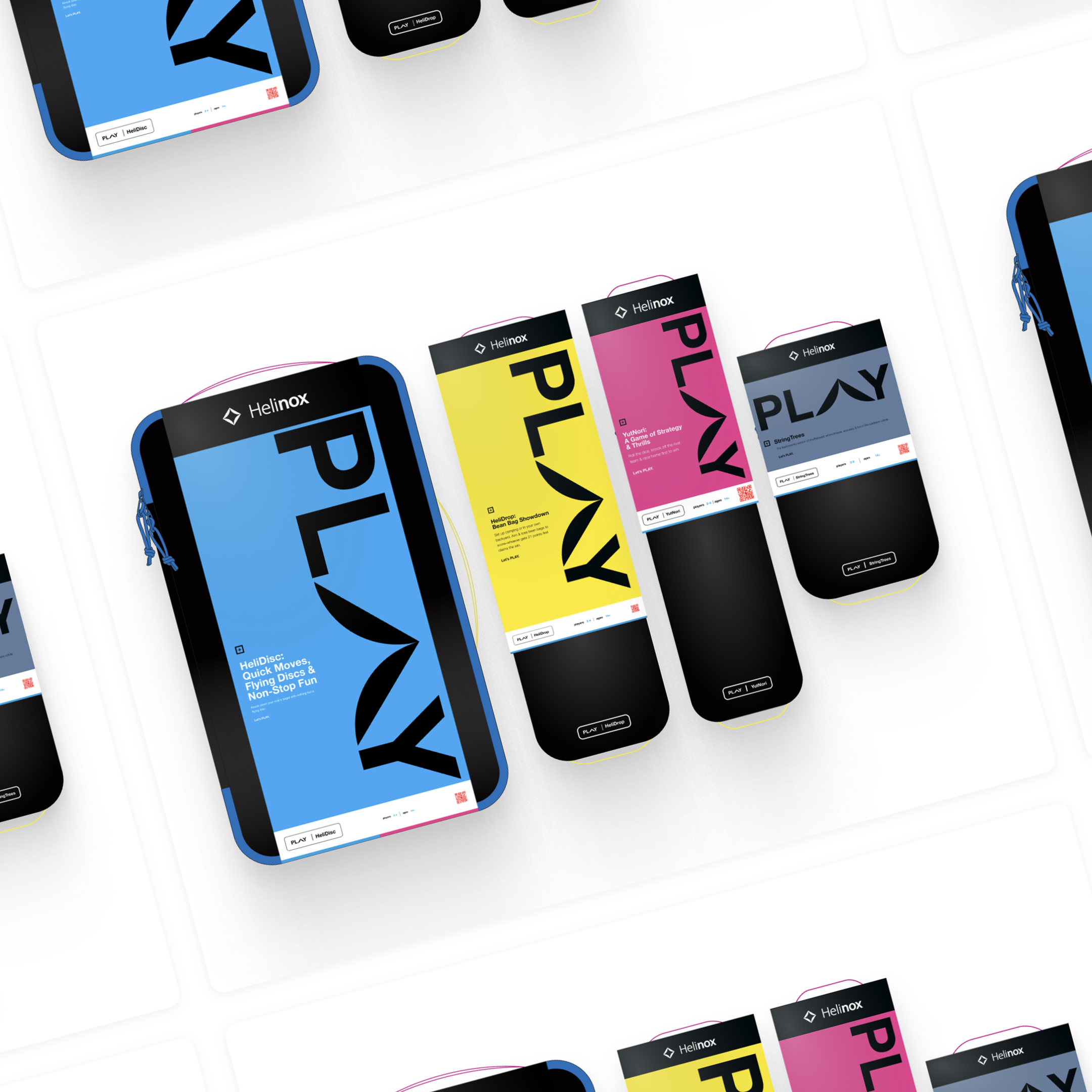
The brief called for a cohesive language: vibrant colors for game differentiation, illustrative quick-starts on packaging backs, and seamless Helinox branding integration.
My Design Approach
Drawing from Helinox's core identity, I infused playfulness through bold pops of color, dynamic icons, and interactive storytelling. Collaborated with the team via mood boards and stakeholder feedback to ensure scalability—focusing on a modular system where colors coded game types (e.g., blue for high-energy throwing, magenta for casual tabletops). Emphasis: Make packaging a "teaser" for fun, with front visuals sparking curiosity and backs delivering value via quick guides.
Key Design Phases:
- Research & Mood Boarding: Analyzed competitors (e.g., Spikeball, KanJam) and user insights (e.g., surveys of 40+ outdoor enthusiasts) to define "fun yet refined"—bright hues balanced with white space.
- Color & Icon System: Developed a palette distinguishing games (e.g., primary colors for types); created icons for play styles, reusable across packaging and marketing.
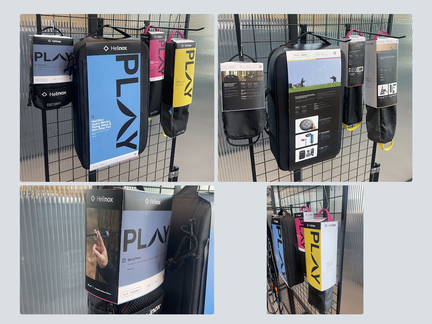
- Packaging Layouts: Designed fronts with bold game names/icons; backs with step-by-step visuals and quick-start text—ensuring scannability in 5–10 seconds.
- Branding Integration: Wove in Helinox logos, taglines ("Lightweight Adventure"), and motifs for cohesion.
- Prototyping & Testing: Mocked physical prototypes; iterated based on retail mockups and A/B shopper feedback (e.g., brighter colors increased pickup rates).
The result was a flexible system: Future games slot in easily, with colors/icons scaling digitally (e.g., for ecommerce pages).
Results & Impact
Rolled out in mid-2025, the "PLAY" line's packaging transformed retail presence, with immediate shopper feedback and sales data affirming its success.
Key Metrics & Feedback:
- Shelf Standout: Bright pop colors drove 40–50% higher pickup rates in pilot stores (per heatmapping), commanding attention amid neutral competitors.
- Shopper Curiosity: Quick-start backs led to longer engagements—shoppers reported "instant understanding" of games, reducing returns by ~15%.
- Sales Uplift: Contributed to 25%+ category launch revenue over projections; Became a top-seller in Helinox's lineup.
- Brand Extension Success: Unified language maintained Helinox identity, with 90%+ consumer surveys noting "fun yet premium" feel.
- Scalability Wins: System adopted for two new games post-launch, saving 30% on future design time.
The project not only launched "PLAY" strongly but set a template for Helinox's playful expansions, blending fun with functionality.