Packaging & identity · 2024
Helinox PLAY — a precision brand learns to have fun, without forgetting who it is.
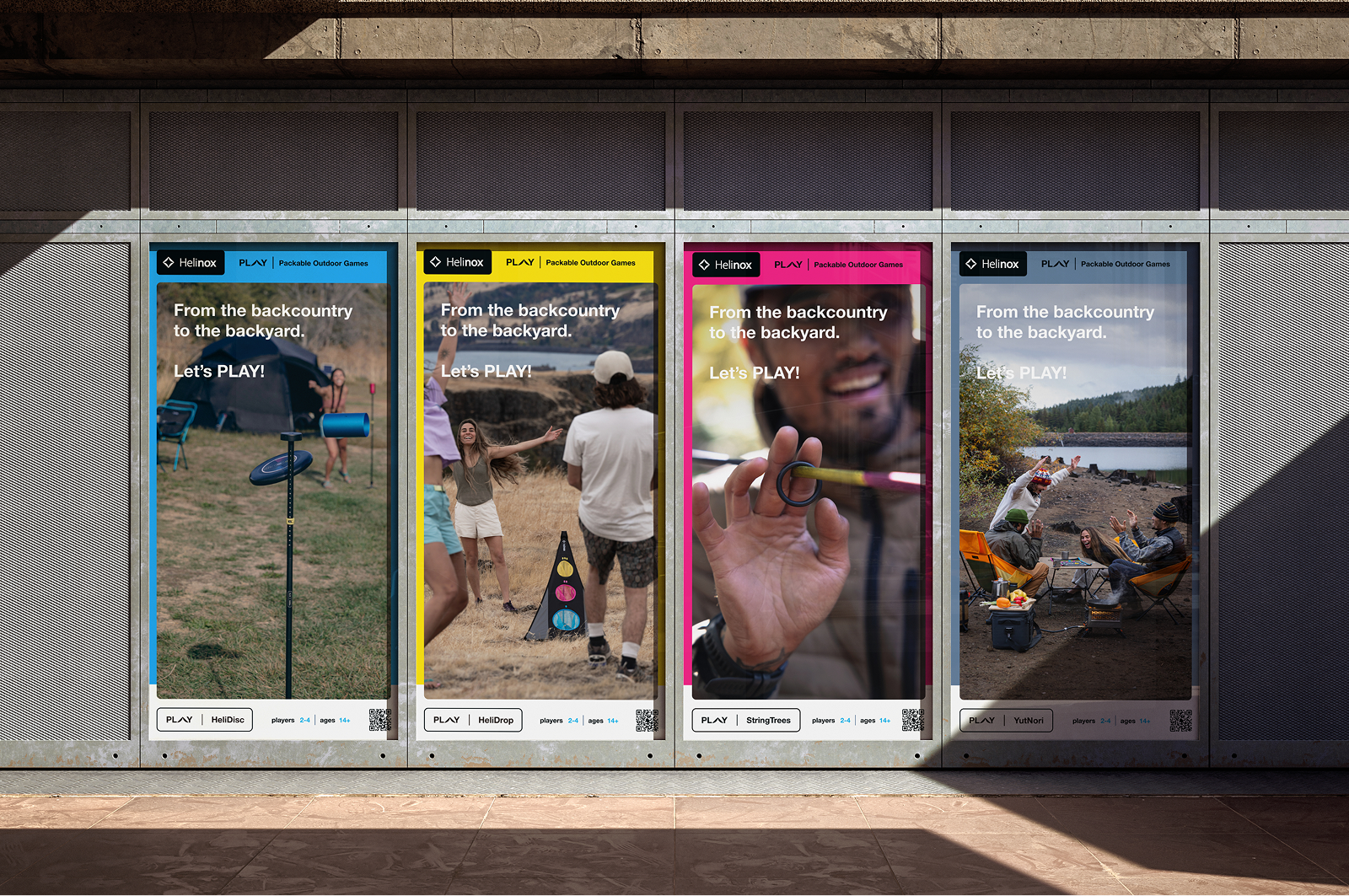
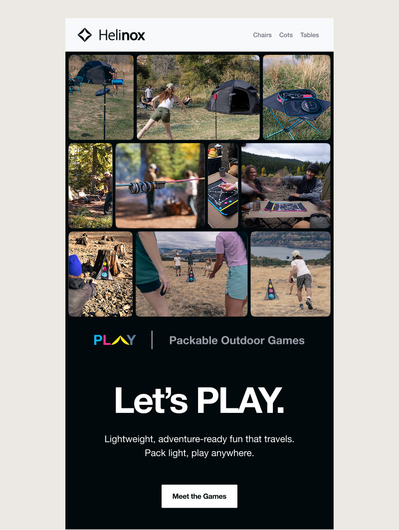
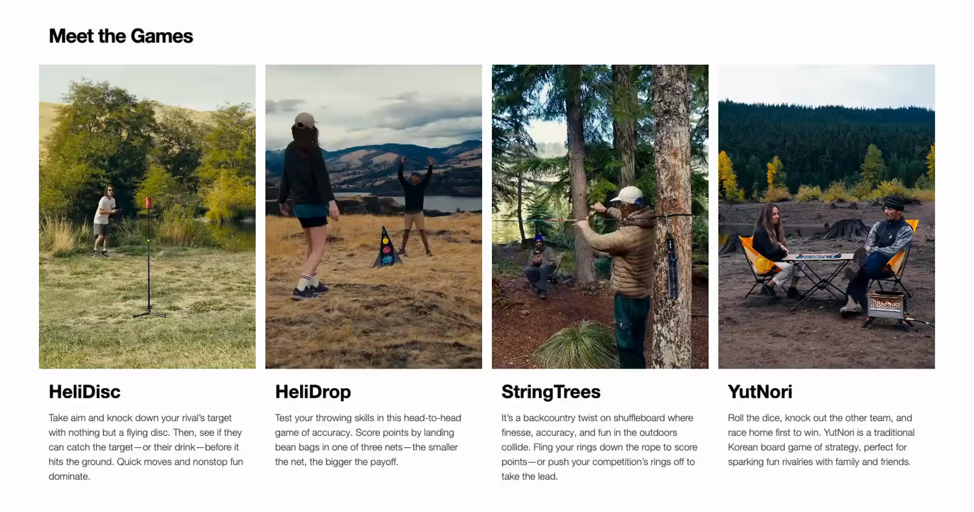
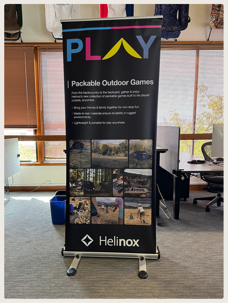
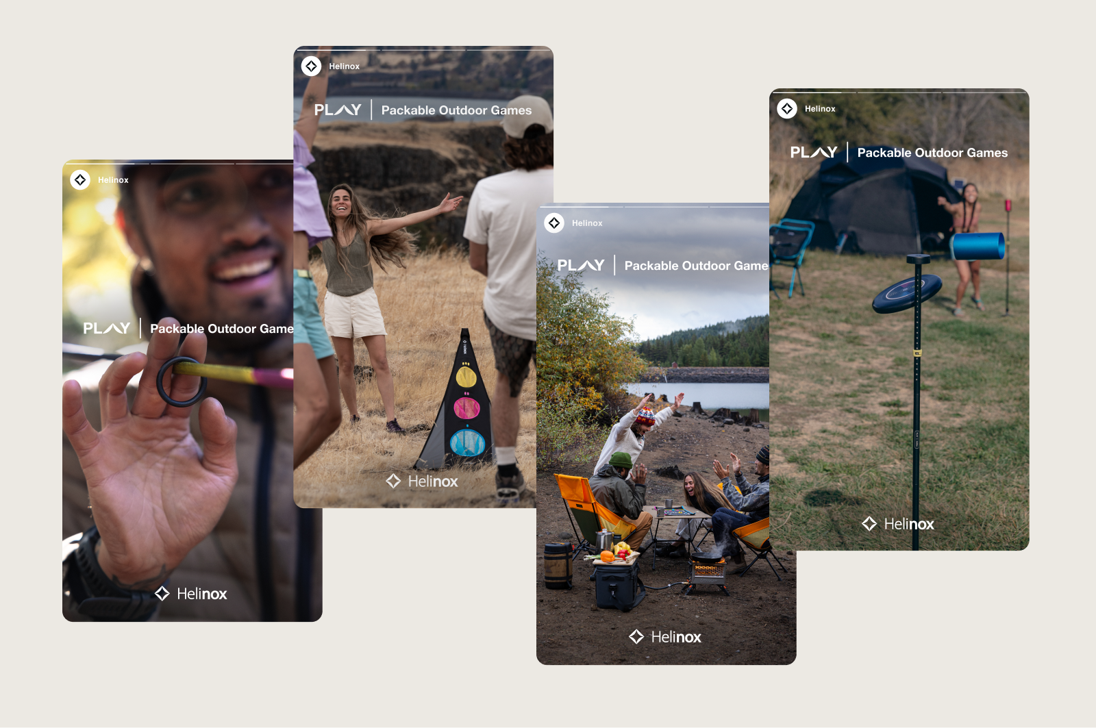
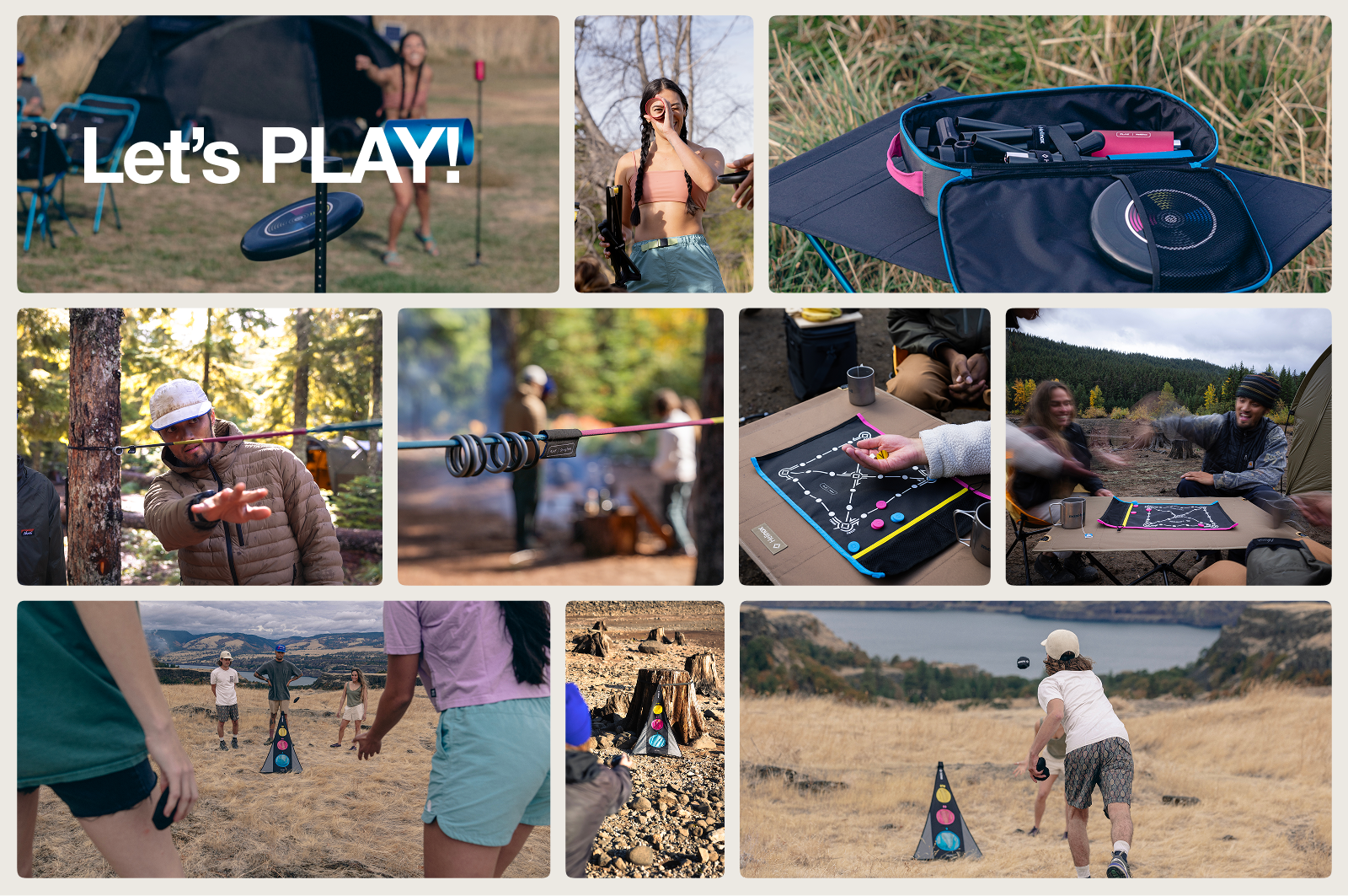
PLAY was Helinox's first move into outdoor games — compact, portable throwing, tossing, sliding, and tabletop sets, and the brand's first real foray below its usual price point. The category decision came from the top: leadership saw everything Helinox made sitting above $100 and wanted a way in for a wider buyer. That left a design problem nobody had solved yet — how do you make something playful and affordable that still, unmistakably, reads as Helinox?
I owned the creative answer. Working from a direction set by the Art Director and leadership, I built the packaging design language, the system that organized the whole line, the individual game identities, and the retail presence that introduced the category at shelf. The core idea was simple: color tells you what kind of game you're holding. Each play type — tabletop, throwing, tossing, sliding — carried its own color, turning a shelf wall into a family a shopper could read in seconds. From there, refined game logos and a consistent back-of-pack system took each buyer from curious to confident without a wall of text.
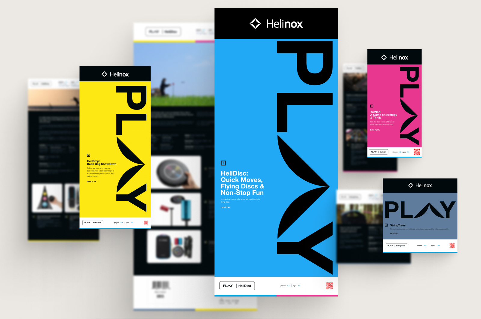
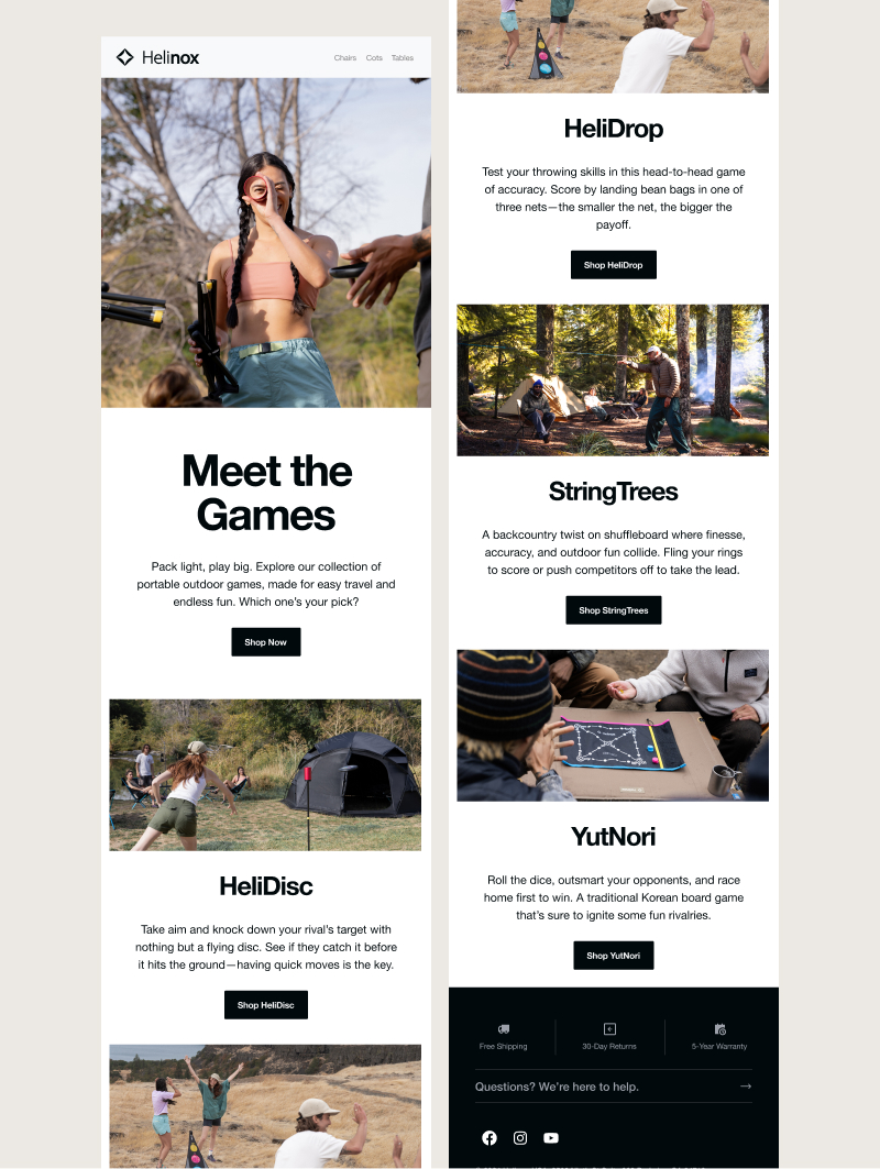
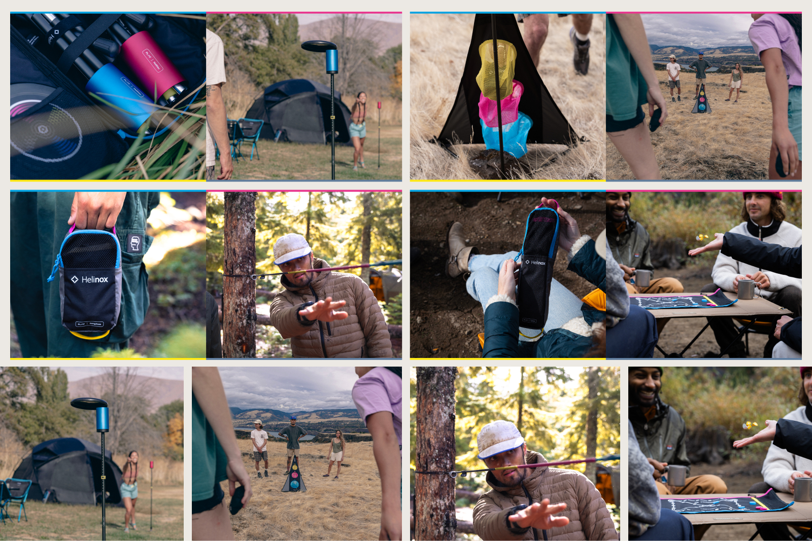
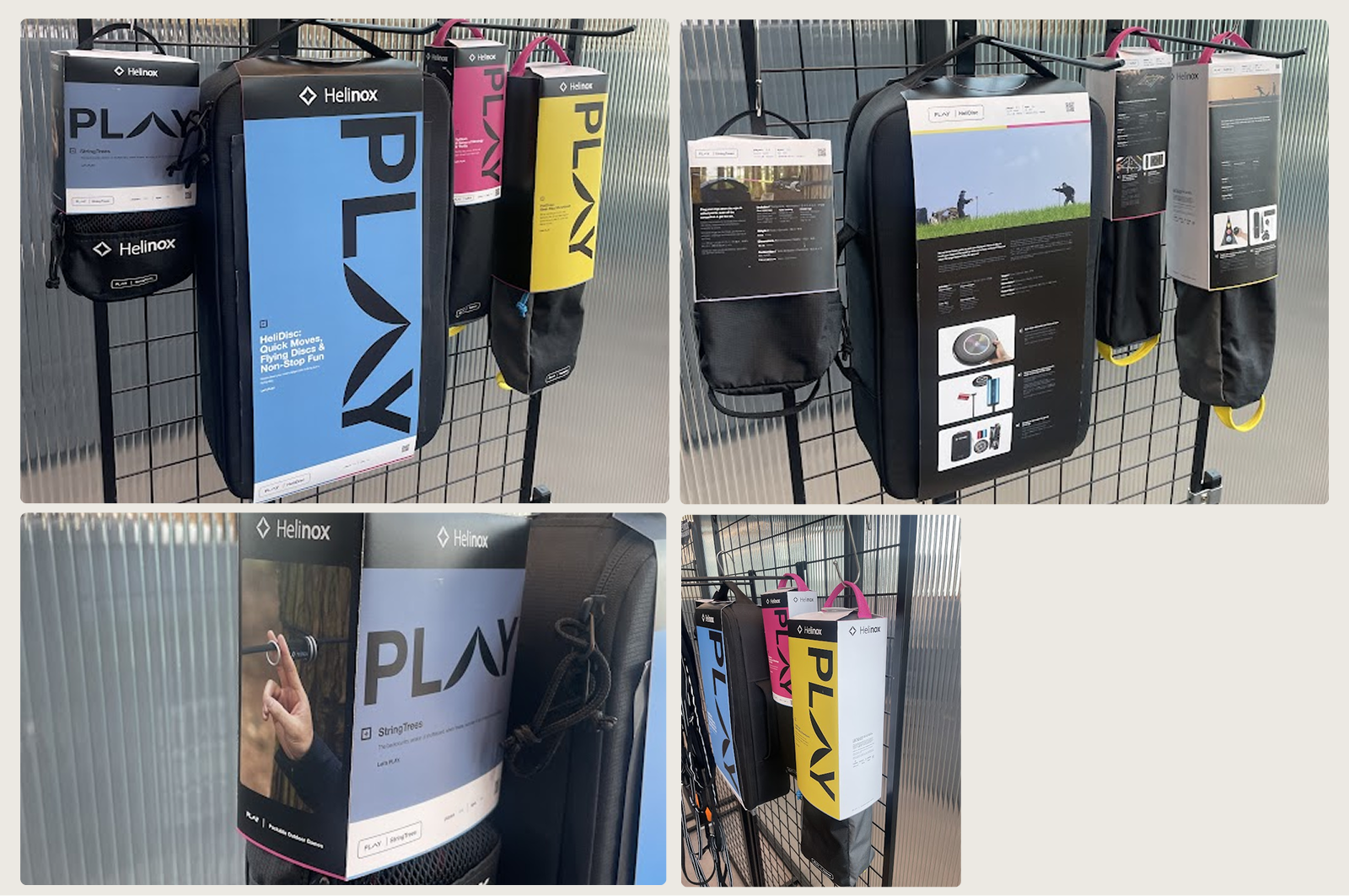
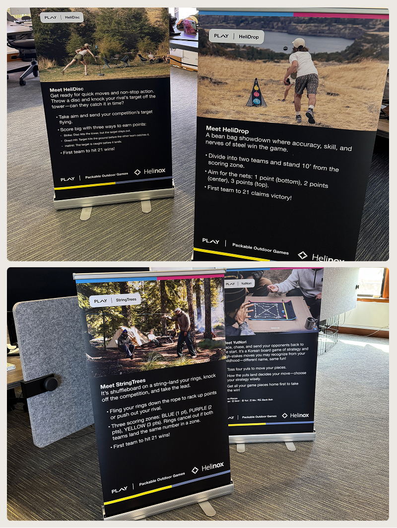

PLAY was a team effort with clear lanes. The category strategy was leadership's; the palette direction and the master PLAY logo came out of work with the Art Director. What I authored was the system underneath — the color-as-game-type language, the individual game identities, the packaging architecture, and the retail design that brought it to shelf.
The piece I'm proudest of isn't any single box; it's that the framework outlived the launch. New games dropped into the color-and-badge system cleanly, without reinventing anything. A good system is one other people can keep building on. This one did.