Brand System · 2014–2020
Timbuk2 — From messenger bag to global lifestyle brand, one strip of webbing at a time.

Timbuk2 didn't need to invent its credibility — it had earned it. Born in San Francisco's bike messenger community, custom-made and built to last, the brand had genuine cultural equity that most companies spend decades trying to manufacture. The problem wasn't who they were. It was that nobody had written it down.
The rebrand designed by the studio behind the Google Drive and American Giant logos gave Timbuk2 a modern visual identity — logo, typography, patterns, a style guide. What it couldn't account for was what came next. A new CEO. A deliberate pivot away from bike toward lifestyle and travel. And a brand that needed to evolve without losing the one thing that made it Timbuk2. That's where my work began.
The governance document was the output. The fight was what made it necessary. The product team had been operating without standards — logos blown up beyond proportion, clear-space ignored, placement driven by whoever had the strongest opinion that week. I saw it happening and kept raising my hand. My Art Director told me to let it go. I didn't. I made sure the CEO understood what was at stake, and when board members pushed for larger, more prominent logo placement on the bags themselves, I pushed back. The CEO sided with the design. The board members eventually came around — not because they were convinced in a meeting, but because the bags spoke for themselves. Restraint turned out to be the argument.
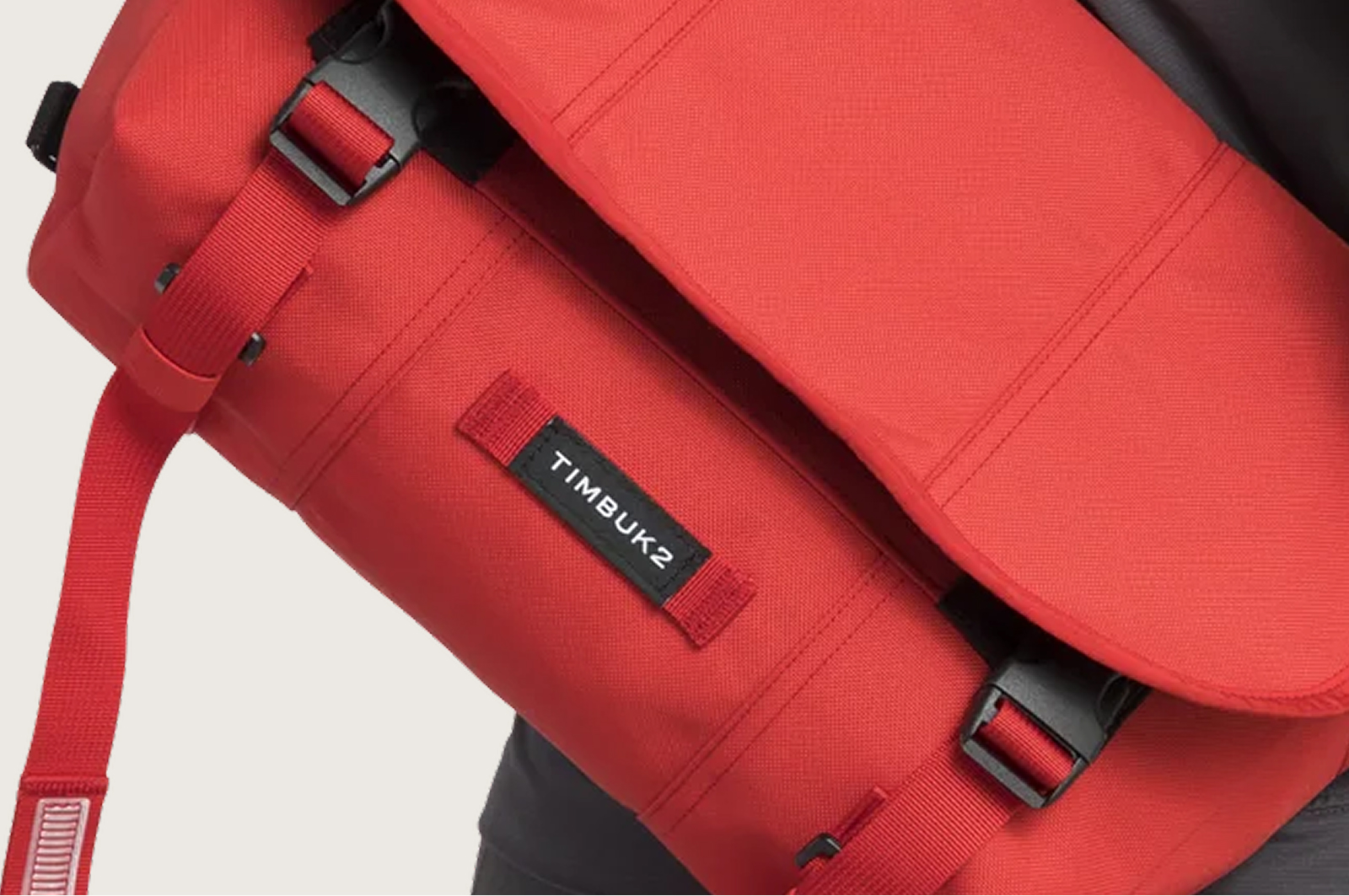
The most important thing I made wasn't a campaign or a site. It was a strip of webbing, dubbed Blinky — originally a functional detail on messenger bags for attaching a rear bike light — became the design system's connective tissue. Codified into the product standards, it gave every designer a shared heritage element to work with. The bike DNA stayed alive as the brand grew beyond it.

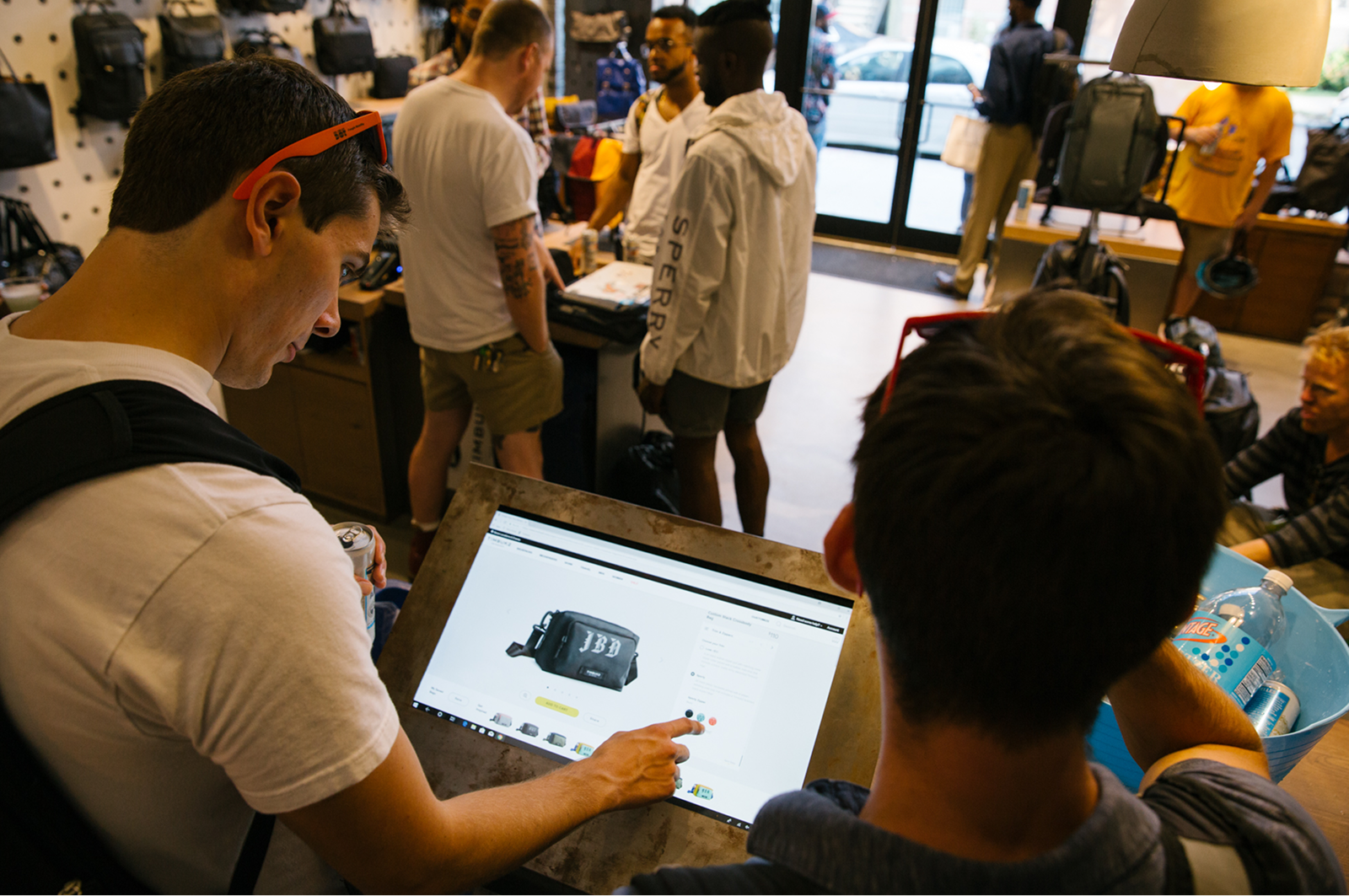
Timbuk2 had always made bags to order — custom was in the DNA from day one. What it hadn't done was treat custom as a growth channel. Working with the head of retail and corporate sales, we built two new experiences around it: custom parties for corporate teams, where groups could design and order their own bags together, and a shop-in-shop experience that brought the customization process directly into retail stores. The design system had to flex to support it — every configuration, every colorway, every corporate logo placement had to look intentional and on-brand without a designer in the room. That's what the governance work made possible. Custom grew 25% as a result, but the more important thing was that it turned a heritage product feature into a scalable business.

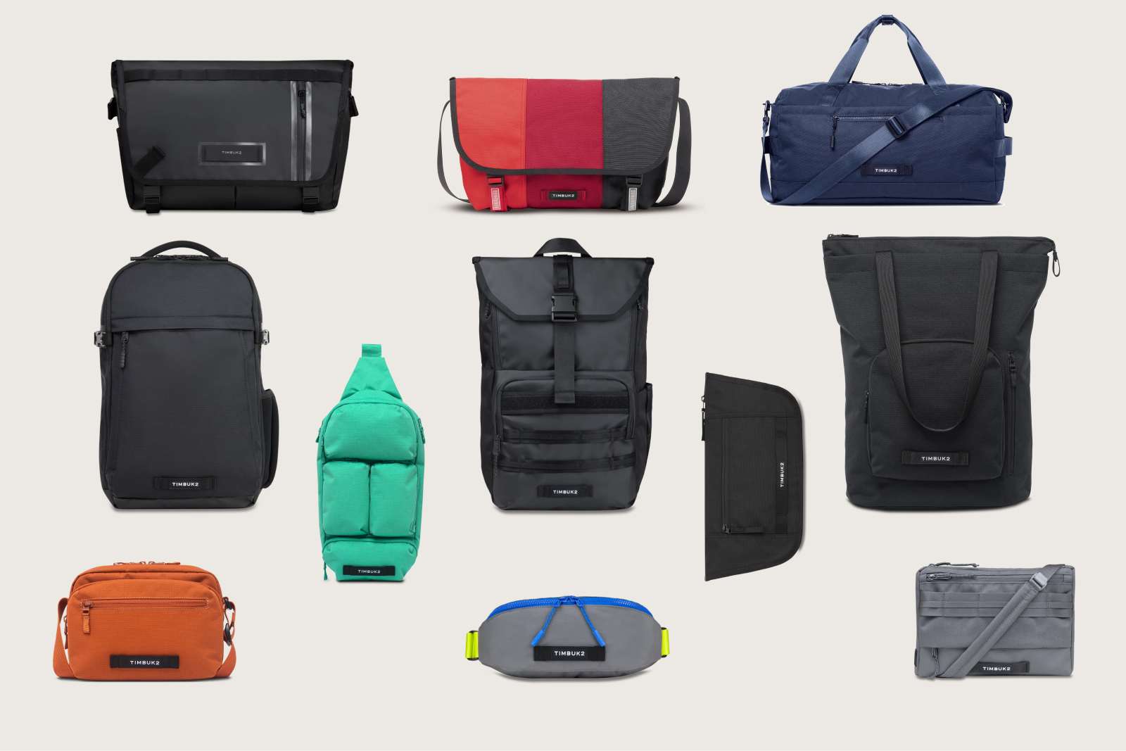
Six years is long enough to watch a brand go through real change. Timbuk2 moved from bike messenger to lifestyle to travel — three distinct audiences, three different versions of what the brand needed to say — and the work was to make sure it never looked like it was having an identity crisis along the way. That meant the standards had to be tight enough to govern and loose enough to grow.
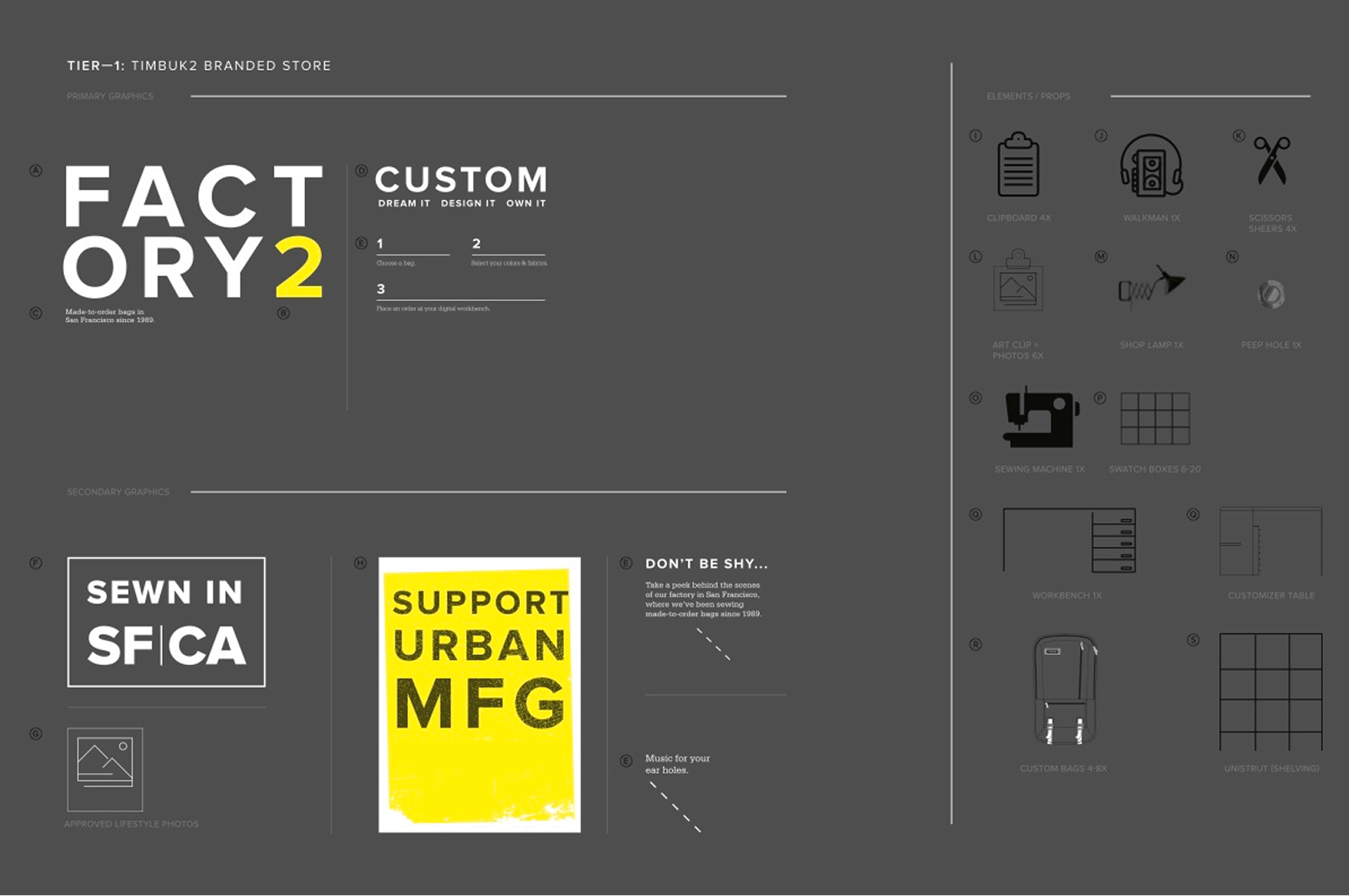
The infrastructure came first. The standards weren't a designed artifact — they were a written argument. Logo sizing, clear-space rules, placement logic by product category, and the reasoning behind each decision. Precise enough that a product designer in a PLM meeting couldn't misapply them accidentally. Durable enough that they held for six years across a CEO transition and three brand evolutions. A DAM that replaced the chaos of shared drives and gave the whole team a single source of truth. And eventually a platform migration from Demandware to Shopify— a case I made years before it happened, building the argument through business intelligence and a level-headed e-commerce director until it reached the CFO and board. None of it was glamorous. All of it was necessary.
What Timbuk2 taught me was what a brand system actually needs to survive — not just a style guide, but the operational backbone to enforce it, the cultural buy-in to sustain it, and something true at the center that doesn't change when everything else does. For Timbuk2 that was Blinky. A strip of webbing. The bike DNA that outlasted every audience shift and held the whole thing together. But the governance document that codified it wasn't just a set of visual rules — it was a product argument. When to use Blinky, and when not to. Weather-resistant bags, for instance: puncturing the material to sew the label compromises the waterproofing. The brand had to yield to the object. That kind of reasoning — design serving function, not decorating it — is what made the system credible enough to actually follow.