Website Redesign · 2020–2021
NADA — Unifying a century-old institution's digital presence across every audience it serves.
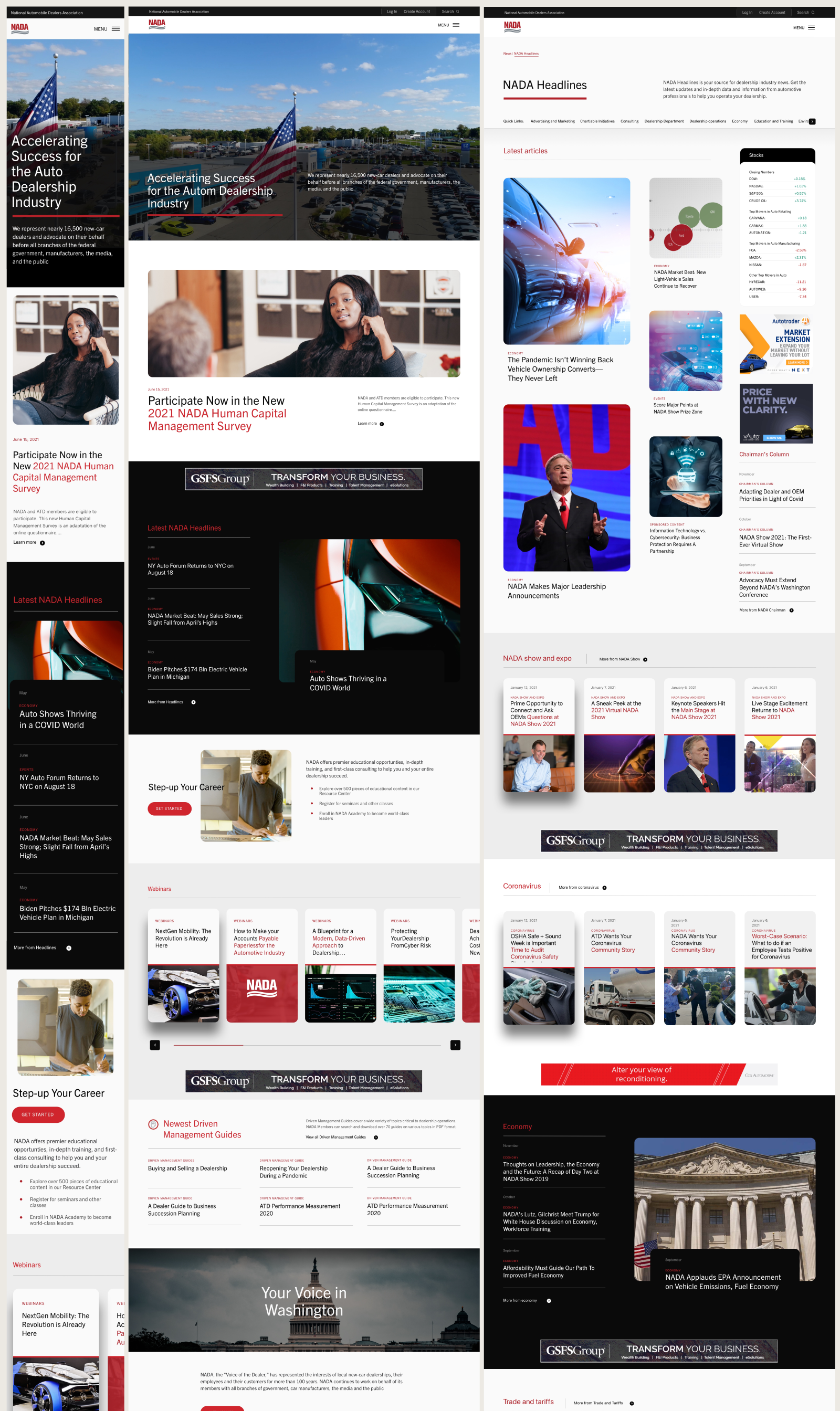
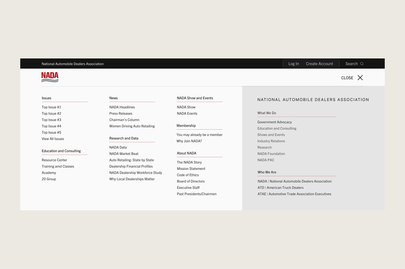
NADA had spent over a century building authority in the auto industry — advocacy, education, research, the annual show that draws 25,000 attendees. The digital infrastructure hadn't kept pace. Ten separate websites across multiple platforms, each with its own visual language, its own navigation logic, its own version of what NADA was supposed to look like. Members couldn't find what they needed. The organization couldn't present a unified front.
Tombras was brought in to fix it. As the lead designer on the project I worked alongside UX, content, and technology teams through a process that started with 12 rounds of stakeholder interviews across NADA's internal departments — understanding what each audience needed, where the current experience was failing them, and what a unified system would have to do to serve all of them at once. What followed was nine months of weekly agile sprints — low-fidelity wireframes handed off from UX, transformed into fully resolved design mockups, reviewed with the client, refined, and repeated.
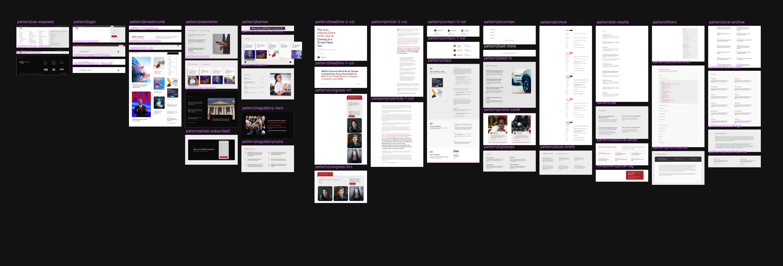
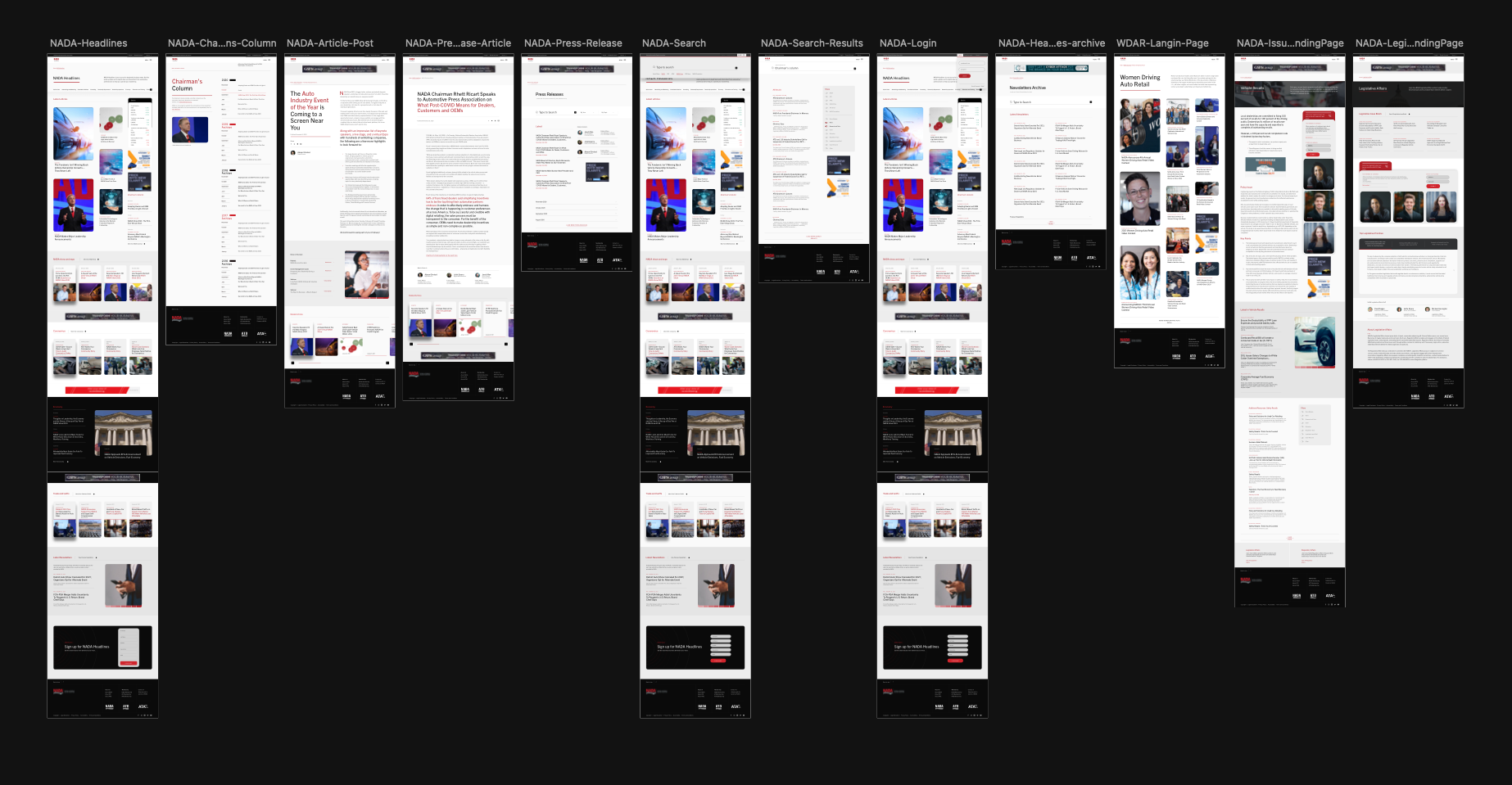
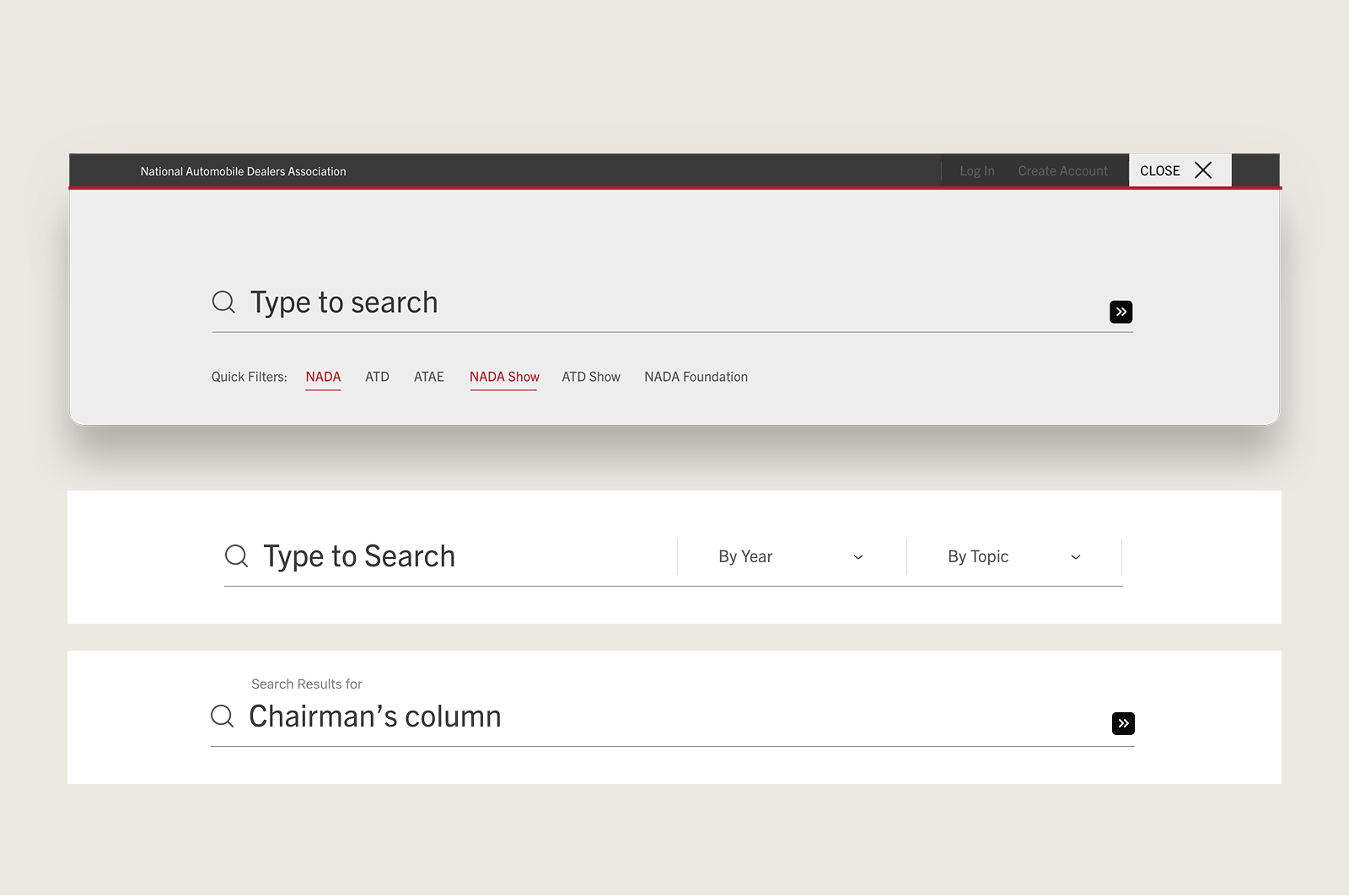
The result was a design system of over 30 unique components — unified enough to hold the whole organization together visually, flexible enough to let individual departments retain their own identity within it. Nine awards followed. More importantly, the traffic did too.
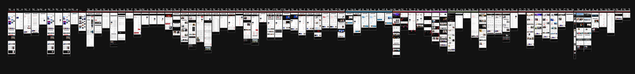


The process was structured in a way that most design projects aren't. Twelve stakeholder interview groups before a single pixel was placed. UX and content teams mapping architecture and taxonomy while the design language was still being established. Every decision made in sequence, each one dependent on the last. For nine months that cadence held — weekly sprints, wireframes in, resolved mockups out, client review, repeat.
The design challenge wasn't aesthetic. It was organizational. Ten websites worth of content, departments with their own audiences and priorities, a 107-year-old institution that needed to feel modern without losing its authority. The system had to have enough consistency to read as one organization and enough flexibility to let each department breathe within it. Thirty components. One visual language. No department left behind.
What NADA taught me was how to translate complexity into clarity. A fragmented organization with competing stakeholders is ultimately the same problem as any other design brief — find the thing that holds it all together and build from there. Watching ten disconnected sites collapse into one coherent digital presence was the clearest proof I've had that systems thinking is design thinking.